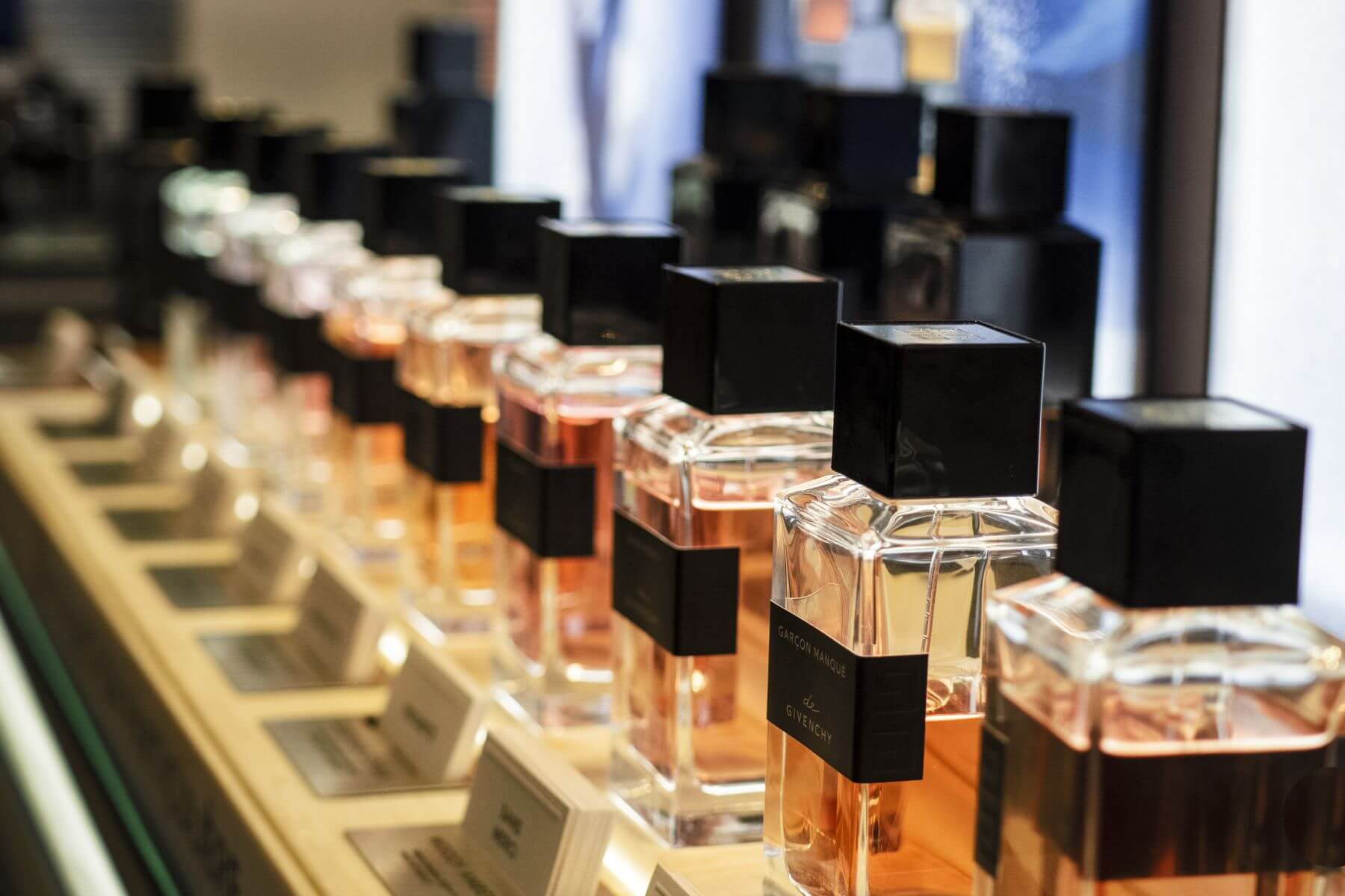
Pre-2020, in-store beauty shopping had one big advantage over eCommerce: testing products. Think swatching, sweeping, sampling and spritzing to your heart’s content. However, in this year’s ‘new normal’, testers and samples are largely a thing of the past, putting in-store and online shopping on an even playing field… almost.
This is only true when a brand’s digital shelf has been optimised with compelling visuals; the kind that make customers feel like they’re seeing, touching or smelling a product in person. However, many beauty brands are missing opportunities to drive increased conversions with their content, simply by failing to add enough images and videos to their product pages.
60% of shoppers say that, before making a purchase, they need to see at least 3-4 images, yet 41% of products only show one image on the product page. Similarly, MMI data shows that 87% of brands are missing videos on the digital shelf, despite product videos reportedly increasing conversion rates by 80%.
With this in mind, we’ve rounded up example asset checklists for beauty brands looking to bump up their visuals, alongside some best practice inspiration, from Fenty to Glossier…
1. Images For Makeup Brands
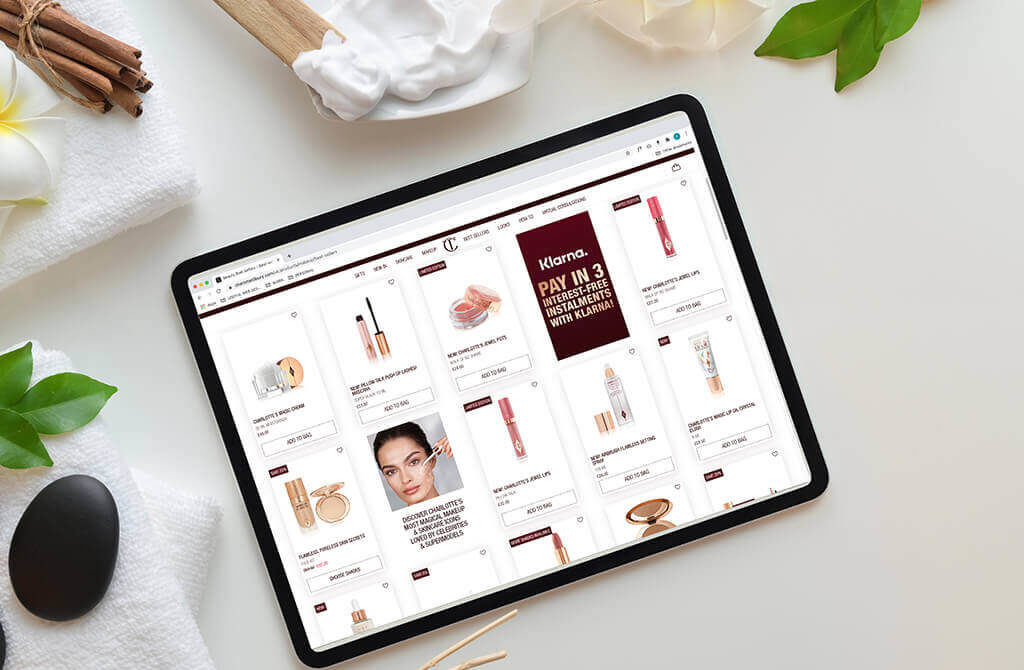
Shade-matching online is a tricky task for customers, which is why makeup visuals need to represent tone and texture as accurately as a camera will allow. Fenty is doing this flawlessly, hiring 50 models to show 50 shades of their Pro Filt’r Soft Matte Longwear Foundation, so customers can pick their perfect product with ease.
But they don’t stop there. High quality swatches of every product – from lipstick to eyeshadow to brow gel – leaves little room for error, giving customers that added confidence when they shop. And, if that wasn’t enough, Fenty’s brand.com digital shelf is bumped up further with the Shade Finder; an AI-driven, highly-visual tool to rival swiping on testers in-store.
The makeup asset checklist:
- Packshots
- Before and afters for base products, like foundation or concealer
- Swatches of complete shade ranges
- Products applied to models of a range of skin tones
- How to apply videos
2. Images For Skincare Brands
Shoppers in the beauty sphere are actively searching for skincare ‘before and afters’, so consider adding these compelling visuals to your product pages. Glossier has nailed it with their Solution exfoliant, teaming packshots with un-retouched images of acne-prone skin, both before using their toner and after four weeks of treatment. This visual proof of results is as impactful as any product copy or review, but authenticity is key: keep lighting consistent and airbrushing non-existent to generate trust.
High quality texture stills are also a must-have for skincare product pages, as they give customers a feel for the product in the absence of in-store samples. Again, Glossier has perfected this, illustrating the change from jelly to foamy lather with a total of nine images on the Milky Jelly Cleanser product page.
The skincare asset checklist:
- Packshots
- Authentic before and afters
- High quality texture stills
- Step by step images
- How to apply video
3. Images For Haircare Brands
The hair category is broader than most. Covering style, colour and care; each sub-category has different visual requirements to meet customer needs. On the care side, Briogeo is winning with ‘before and afters’ on a range of hair types and textures, alongside texture stills that highlight their ‘high-performance ingredients’.
Meanwhile, style and colour present a stronger need for ‘how to apply’ assets – something that at-home hair dye brand Josh Wood is doing particularly well. On the brand.com site, videos demonstrate how easy it can be to colour hair at home, while providing education on the different types of dye available, so customers make more informed purchases.
The hair care, colour or styling asset checklist:
- Packshots
- Before and afters demonstrating a colour, style, or care result
- Swatches of product texture
- Quick, easy step-by-step images
- How-to videos – especially for colour and style
4. Images For Fragrance Brands
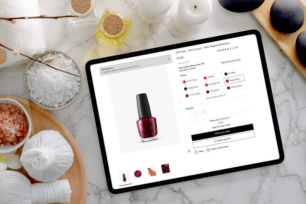
Snaps of sun-drenched skin, true blue lagoons and golden, sandy beaches tell you everything you need to know about Sol de Janeiro’s Sol Cheirosa ‘62 fragrance. The brand, famed for its BumBum Cream, knows how to paint a picture of a scent on the brand.com site, using a range of model shots, stylised still life and a campaign video.
This is no mean feat for fragrance brands. Because it’s such a sensorial category, translating scent onto a screen presents a number of challenges compared to in-store testing. However, evocative visuals and powerful copywriting can build a different kind of scent experience; one where customers make a purchase based on a story or lifestyle they aspire to.
The fragrance asset checklist:
- Packshots
- Scene-setting model images
- Texture stills showing fragrance notes
- Campaign videos
How We Can Help
We are specialists in media and eCommerce data analytics for the beauty industry. Learn more about how we can help you with your digital disruption by clicking below.
Learn More


